Table of Contents
Project Overview
Lexi is an emergency mobile platform that can trigger requests to emergency response teams or provide assistance to a rideshare user to diffuse a dangerous or uncomfortable situation.
My Design Process

The Problem Space
The rideshare industry grew to $85.8 billion dollars in 2021. The two entities that have control the majority of that business (Uber and Lyft) are able to use the law to classify themselves as “platform spaces” to shelter themselves from responsibility for what happens to riders during the course of their service.
Secondary Research
Unsafe Feelings
In a survey of 2021 rideshare users, 27% of riders said they were still concerned for their safety in their rides. Of those surveyed, 50% also had a negative experience with a rideshare driver.
Sexual Misconduct Claims
According to The Washington Post, two main issues came to light from former employees: nearly 1/3 of all complaints reported dealt with sexual misconduct with Uber and Lyft’s responses to misconduct viewed as “inadequate and dismissive.”
Hypothesis
I believe that by providing more safety features and options to choose their driver that riders will feel safer when using rideshare apps.
I will know this is true when there is a decrease of 5% in annual reports of how safe riders feel in their rideshares.
User Research
I interviewed five female riders, over the age of 29, that have used rideshare companies. Given the sensitivity of the subject matter, I wanted to make sure that people would feel comfortable talking about past experiences in rideshares and that they knew how private and anonymous these interviews would be.
I asked these women a series of insightful and open-ended questions such as:
What would make you want to report a bad ride or driver?
How would you or someone you know go about reporting a bad rideshare?
If you know someone who had received any unwanted sexual advances from a driver, was it reported to anyone?
What changes would you like to see rideshare companies make to provide riders a safer option?
Competitive Analysis
My research interviews focused on rider’s existing relationship with rideshare platforms as well as the changes they would like to see within the app. I focused specifically on female riders. I will use this information to serve as the roots to developing solutions for riders to feel more safe. I strive to gain:
Insights into how they have been treated by drivers in the past
How comfortable they feel reporting issues to these companies or police
What digital solutions could help ease any concerns they have for their safety in rideshares?
Interview Analysis
I synthesized my research data and felt there were three high-level themes from the insights I gathered. Those major themes were:
I felt that Safety Measures was the most important theme that my app should provide a solution to. Riders are trusting rideshare platforms to get home, and in some cases, they are being let down. By creating a safety app on this end, I can give them a tool to seek assistance quickly from 911 instead of waiting for rideshare platform to assist them.
Design Challenge
How might we accommodate female riders in providing more safety features when using ridesharing apps in order to ensure a more comfortable rideshare experience?
User Persona
I created a primary persona to represent and personify user groups who have similar behaviors. This gave me an opportunity to become more empathetic and establish a clear picture of different users’ expectations and how they would potentially use a product solution.
Experience Mapping
By thinking of myself as our persona, I created a real situation that Alicia would go through with requesting and completing a rideshare. By examining each step she would need to occur for her to complete this ride, I was able to gain knowledge and identify opportunities to design solutions that would make a quantifiable and real impact.
User Stories & Prioritization
From examining the different points of view possible for our persona, I was able to create a series of user stories that turned her pain points into solutions. Upon examining these solutions, I had to analyze which of these solutions would be feasible and the most practical. I organized the user stories into three themes:
Decisions for the Rider
Desired Platform Inclusions
Needed Safety Features
Design Pivot
When synthesizing these user stories, I had some new perceptions on the direction of this process. First, I knew the solution to this design challenge couldn’t be a reworking of the Uber or Lyft platform due to their legal classification of being a “platform”. Secondly, I realized that everyone interviewed did what they were supposed to do when getting into the car by verifying all driver and car info.
This lead me to realize that I needed to pivot my design challenge and create a solution that brings power and safety back into the user’s control.
Revised Design Challenge
How might we give more control to female riders while using ridesharing apps in order to ensure a safer ride experience?
Task Flow Mapping
After three revisions, I finally was able to stitch a flow that I felt best suited the problem and the solution. This fourth version not only completes the task but completes the task in the quickest and most concise way possible.

Ideation Sketches
With my task at hand, I started to sketch and create this app. Best on researching other safety apps, I knew what features that I would want, features I didn’t want, and features that would set this app apart from the others. I needed to focus on an obvious place to submit the request for 911 and to keep the user informed on how soon that help would be arriving.
Wireframes
After narrowing down on some different designs and features, I was able to create my first version of my mid-fi designs before I looked at getting feedback and testing.


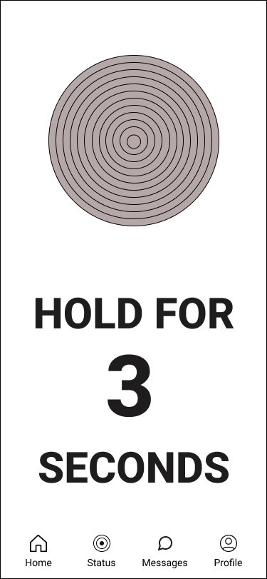


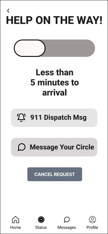
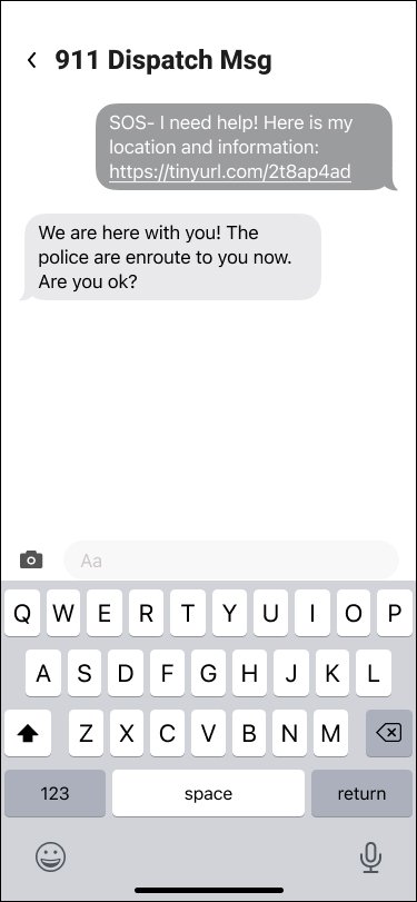


With each set of tests, I synthesized the results with Design Prioritization Matrix. Except for cosmetic changes, I felt the below changes best dealt with issues in successfully completing the tasks.


How would you request 911 assistance?
How will you confirm your location?
How can you view any messages from 911 dispatch?
How can you send a message to 911 dispatch?
User Testing
I did user testing with two different versions of the prototype. Each test consisted of 5 female testers, 10 in total.
I asked each tester to complete the following tasks:
Final Prototype
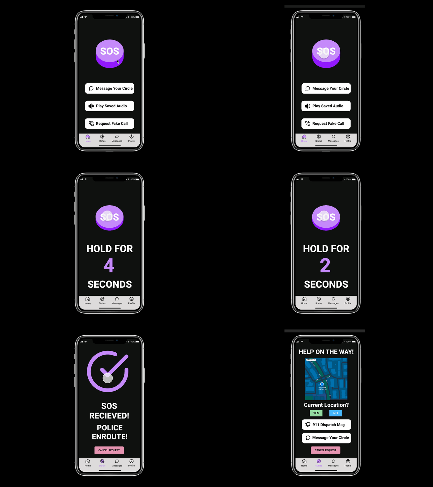
After user testing, design changes, and “SOS” button choices, Lexi has come to life. Lexi is an emergency mobile platform that can trigger requests to emergency response teams or provide assistance to a rideshare user to diffuse a dangerous or uncomfortable situation. Below, see her in action:


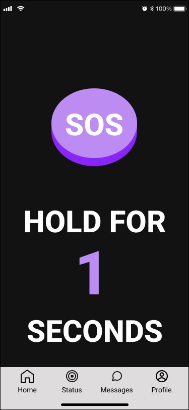


Submitting an SOS to 911
As soon as our user opens up the app, they are immediately able to hold down the SOS button to silently and discretely request help from 911 to intercept their rideshare. When 911 receives the request, they are also sent all of their ride information: driver’s name, car mode, license plate and their location.
Confirming Location & Messaging 911 Dispatch
Our user has successfully sent a request to 911 for help in interrupting her dangerous rideshare. She is able to give additional information on the current area she is in. Once her location is confirmed, our user is able to open a communication message from the 911 dispatcher. Here, our users she’s her initial request and can keep constant communication with the dispatcher,
911 Status Update Upon Arrival
After sending any additional messages to the 911 dispatch, our user is brought back to the status page. There is an update on how soon the police will be reaching her. She receives a message that the police are about approaching her vehicle
How Did Lexi Become….Lexi?
While designing the features and the layout for this app, I had some characteristics that would heavily influence the name. First, the app needed to have a female name. In case anyone was to see the user open it up, this would avoid any concern she was texting a male figure. Secondly, I wanted to name the app after a popular tv character. The reasoning for this is the established relationship that people have with characters from their favorite show. Some popular ideas I considered were Samantha Jones, Meredith Grey, Detective Olivia Benson, but I felt I needed to choose a character that appealed to both Millennials and Gen Z.
I decided to name the app Lexi. Lexi Howard is the dependable and relatable best friend in the hit tv show Euphoria. The show spans both generations, and the character has quickly become a fan favorite for being responsible, accountable, and a comfort no matter when you may need her. The show is shot in a very particular dark setting; some would describe it as “dreamy pop.” You see the same pallet of colors throughout each episode.
These colors especially work with a darker background. I decided to do the design the app in dark mode. When surveyed, most users said they had problems with rideshares at night. The font, Roboto, was chosen because rideshare companies, TikTok, and Instagram also use san serif fonts .
What is Next for Lexi?
Designing Onboarding Screens and Expanding on Other Key Features in the App
Additional Testing and User Feedback with Other Communities
When creating this app, I designed the app with the task that a rideshare user was in danger and needed to contact 911 for help. It was insinuated that the user had already signed up for the app given the urgency of the task. I would like to create the onboarding pages to further expand on the features of the app and help users build their circle of trusted contacts.
I would like to continue testing and getting additional feedback. Originally, this app was built with the intention of finding solutions for female rideshares. Problematic rideshares are not just happening to females, and I need to speak to others outside of that group on how this problem affects them and what adjustments I could make on the app to serve more communities.
What did Lexi Teach Me?
Change is Inevitable and My Initial Ideas May Not Make the Cut
Get Ample Feedback Before Making Design Changes
It’s hard to not go into a project with ideas in your mind on design solutions. I had to consider the constraints on how and who could help the rider. After listening to the needs of those interviewed, I realized what I thought the app would be couldn’t successfully solve the problem at hand. I had to create a solution that they could control and was not dependent on what the rideshare companies would let them do. The ability to work around those limitations and look to see what would serve the user and their needs is a successful product, which is always the end goal.
It’s great to test often and with many users. I was a bit too eager to make changes as I went along during the first round of user testing instead of looking at the results. After completing a second round and evaluating a prioritization map on suggested changes during feedback, I realized that part of the initial design was more successful than I had first considered. Users will always differ on what they like and do not like, and it’s imperative to look at the overall picture of what collectively works best for everyone.


